
A few years ago, I worked a performance project. You probably know the type: Customers were upset, executives were upset, technical staff were asking for specific direction (and not getting much) … nobody was happy.
The code was already in production, and there was no obvious ‘roll it back to the previous version that is just fine’ trick for us to pull. It was pretty bad.
There are worse projects. When the technical staff starts pointing fingers at each other, then you know nothing is going to get done. At least we had hope.
Then came the fateful day. The CEO was on the conference call, and he said, very sincerely, “We’ve got problems with the website … we really need some more testing.”
At this, the director of product quality perked up. “I have to politely disagree. Testing will tell us if the product is slow or not. We already know the answer to that question: It is slow. In addition to knowing it is slow, we know what parts are slow: We have gigabytes and gigabytes of performance data to look at. It occurs to me that we need something else, other than performance testing; we need performance fixing.”
He was right. We did get to fixing, but the next step was to analyze that performance data, to find opportunities for improvement.
It turns out that analyzing can be surprisingly challenging. More about that today.
Averages
I recently wrote about ‘average’ response time, and how it can be deceptive. Let’s go into that in a bit more detail.
Say you have around four hundred different timings to evaluate; they all alternate between in the one and eleven second area. The average of this is six seconds, but that six second number doesn’t have any meaning, does it? Not really.
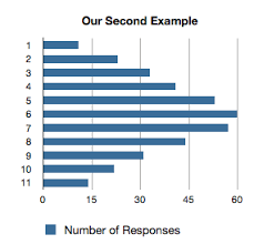
Now say the dataset looks more like this:
Modeling that as a bar chart, we get something like this:
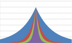
I think we would agree that the first example (1,11,1,11) is two different behaviors in functionality — the ‘average’ is meaningless, which the second is a legimate bell curve.
What’s the difference?
One important difference is standard deviation.
No, don’t look at me like that. This isn’t hard. I’m not going to throw a bunch of symbols at you to confuse you or to sound smart. But in order to do real performance work — heck, just to know that we haven’t been fooled — we need to dig a little deeper.
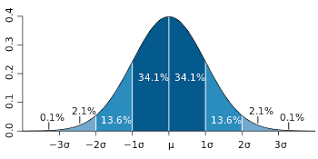
About Standard Deviation – No Funny Math Symbols I Promise
Here’s another example: The average USA credit card debt per household is $15,799. That could be a bell curve – or it could be that twenty-percent of american households have heavy debt, averaging around $80,000, while eighty percent have lighter debt, averaging more like three thousand dollars. Both make the average true.
One way to slice the data is to figure out how far the ‘typical’ household is from that $15,799 “national average” – that is, how far the typical household deviates from the average. We’ll call that deviation.
It turns out there are a bunch of ways to calculate ‘typical distance from the average’, the most common of which, standard deviation, has become, well .. a standard.
Here’s how it works:
We take each distance and square it, then divide by the number of elements. That is called the variance. Then we take the square root of the variance, and that is the standard deviation. (Don’t worry, I’m about to walk through some examples.)
Why all the square roots? Well, the short answer is that we want to punish numbers far away from the average and reward those close to it. Mathisfun.com has a longer explanation – they do at least try to make it fun.
Let’s walk through it –
In the first example above, our data series looks like 1,11,1,11,1,11,1. The average is 6, the distances from the average are all 5. (11-6=5 and 6-1=5). To calculate variance, we add up the squares of the distances (25) and average them; the standard deviation is the square root – five.
So for this simplest of data, we find that the average is six, but the standard example is five away – that’s pretty far.
I need to get out my spreadsheet to calculate the second example. If I had the raw data, I could just use a function, like STDEV(A1:A1000) – but I wanted to build up the tables by hand. Here are my results:
Notice the standard deviation is 2.47, much smaller.
Looking at the two datasets, I could now tell that the second set had data that, on average, was closer to the average. So what?
Here’s a good rule of thumb: If you double the standard deviation, and it falls outside the realm of common sense, you’ve got a problem. So in the first example, our “average” is six seconds and standard deviation is five, so doubling our deviation gives us (6-10)=-4 seconds on the low end and (6+10)=16 seconds on the high end. The first doesn’t make any sense; the second is a serious problem.
For the second example, (6-4.94)=1.06 and (6+4.94)=10.94 – which says that some web pages are fast, and some reasonably slow – but it is likely that our data is valid.
Why All The Harping on Deviation?
When we start looking at performance numbers, we typically start with ‘average’ response time. Average response time is an aggregate – the result of adding up all the numbers and dividing by the number of things counted.
A second way to slice the data is with a histogram – the graphs I showed today. A histogram gives you the number of seconds at each point. If we can tie that to log data, or a particular feature, we can find out what exact features are slow, and sometimes, under what conditions, to improve performance.
Today I was just trying to give you another tool for the toolbox – examples to follow, next time.